SCOPE:
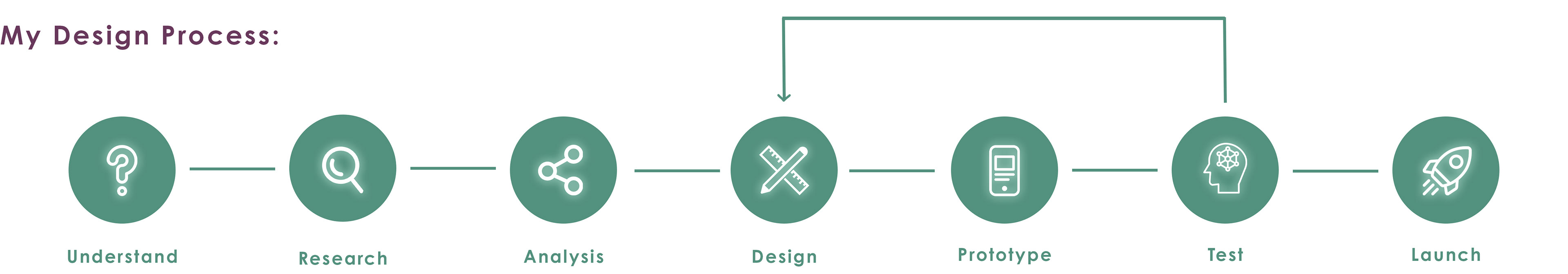
This project was a B2C case study, starting from ideation to a finished prototype. I had the case study problem and a few general feature requirements provided already, but I had to find an impactful solution. My role involved conducting user research through surveys and interviews, which gave me insight into what users are truly seeking and how I could effectively address their needs. After brainstorming several ideas, I organized and translated those concepts into visual solutions. Starting with low-fidelity wireframes and progressing to high-fidelity designs, I developed a testable prototype. The data gathered from user testing allowed me to evaluate and refine the prototype until I achieved a version I was confident in. Throughout this process, I stepped into multiple UX/UI roles, learning and then actively applying a range of design methods.
UNDERSTAND
Problem:
We’ve all found ourselves in situations where we need advice or guidance from a professional. How-to videos don't always cut it and most sources simply aren't reliable. Finding qualified people who are willing to help may seem difficult and too complicated of a process to go through; especially for an answer that is needed urgently.
Solution:
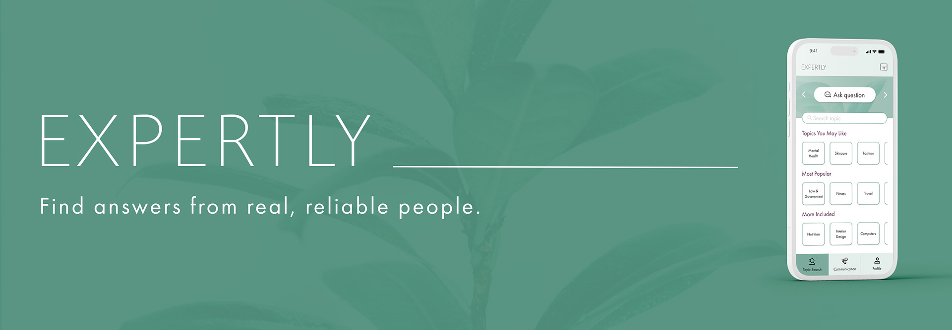
With Expertly, users now have an efficient and simple method of communication between qualified experts and themselves. With countless experts available in nearly any field, users can connect with an expert within minutes and feel more informed and prepared to solve their problems.
RESEARCH
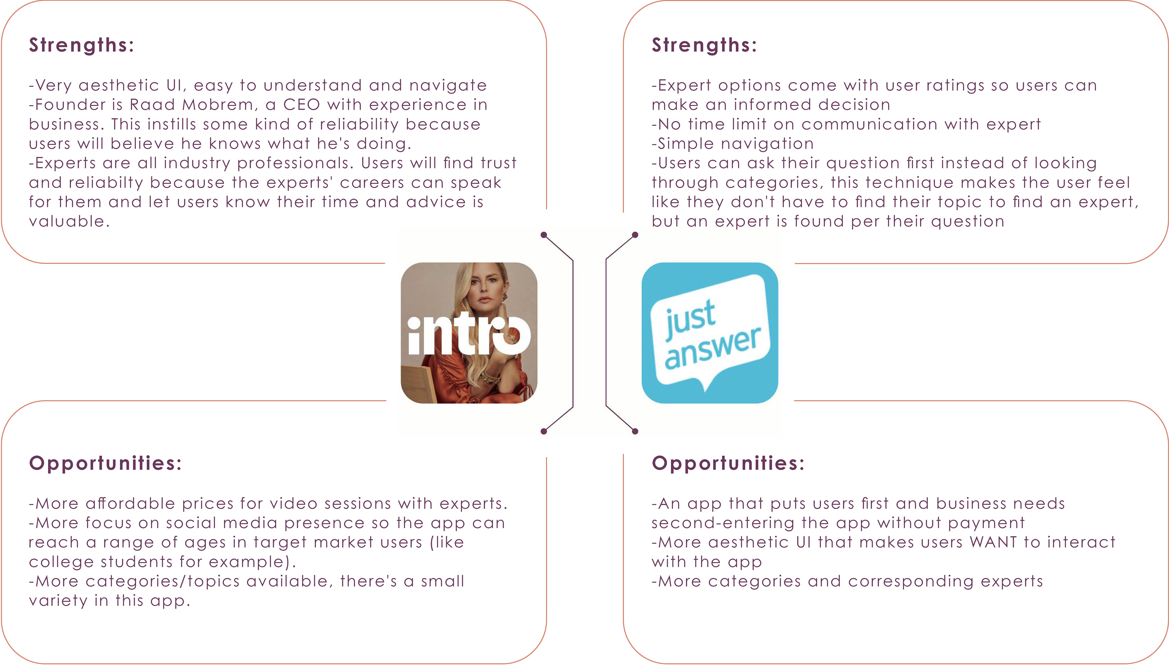
The UX research process involved a competitive analysis with two competitor apps (JustAnswer and Intro) which provided insight on what the current market reflects regarding similar services of professional help. I was introduced to new opportunities for Expertly, and learned of potential shortcomings as well based on the competitor's strengths.
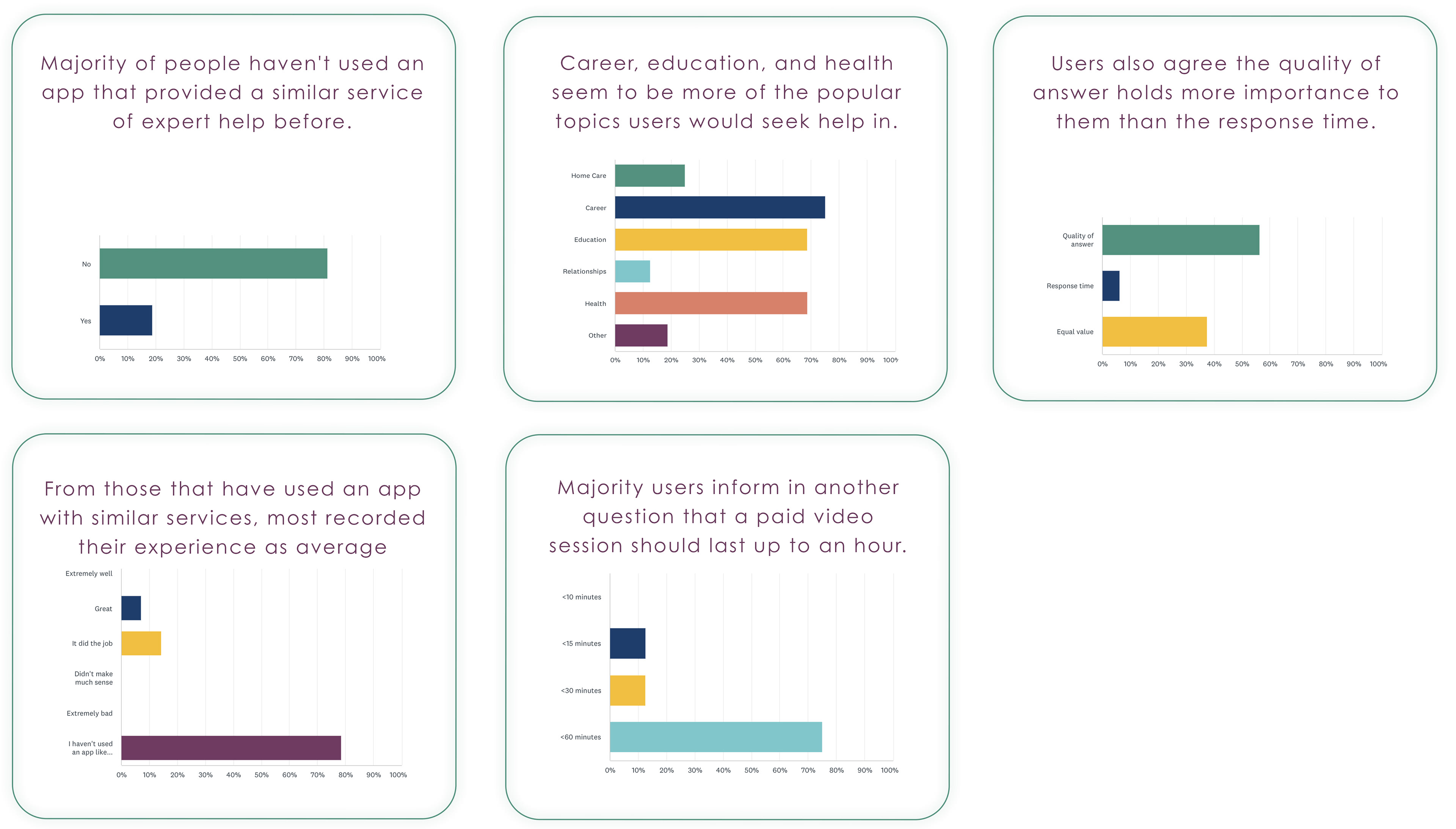
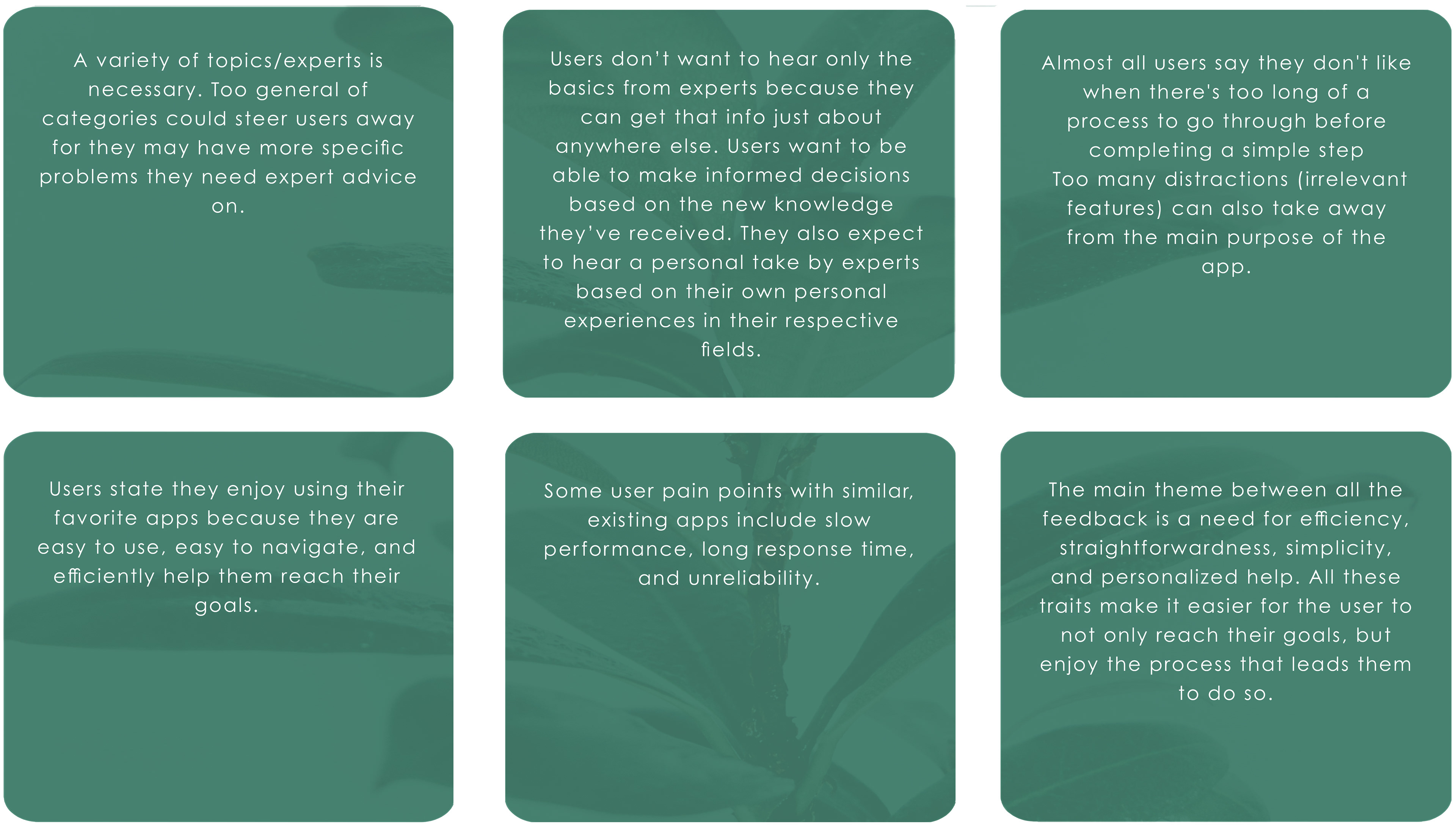
This process also included user surveys and interviews that provided me with an understanding of the target audience and their behaviors and needs. Conducting user research allowed me to reflect on how I can deliver Expertly's goal in order to satisfy the target users.
Competitive Analysis:
User Surveys: Main Insights
User Interviews: Main Insights
ANALYSIS
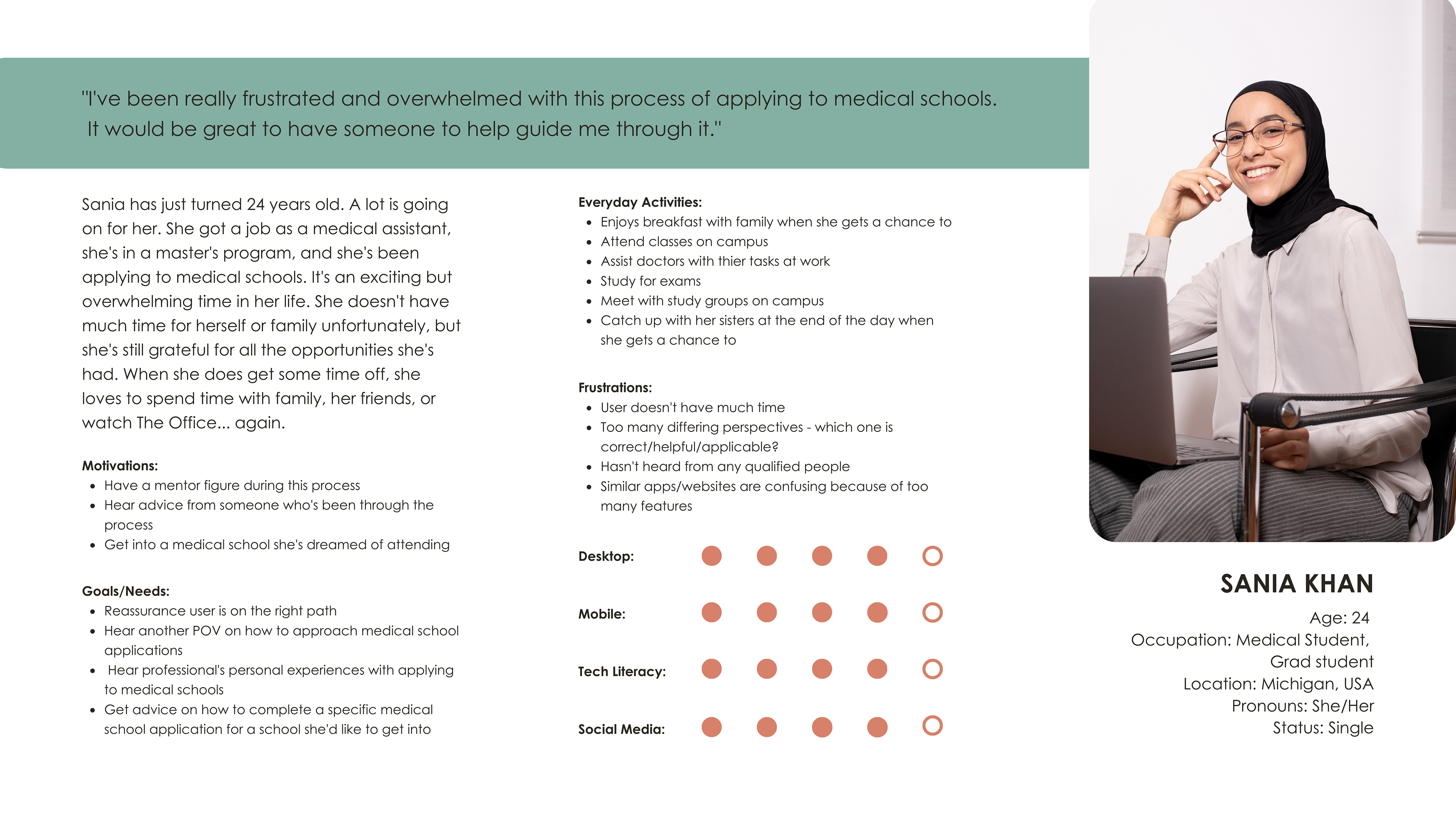
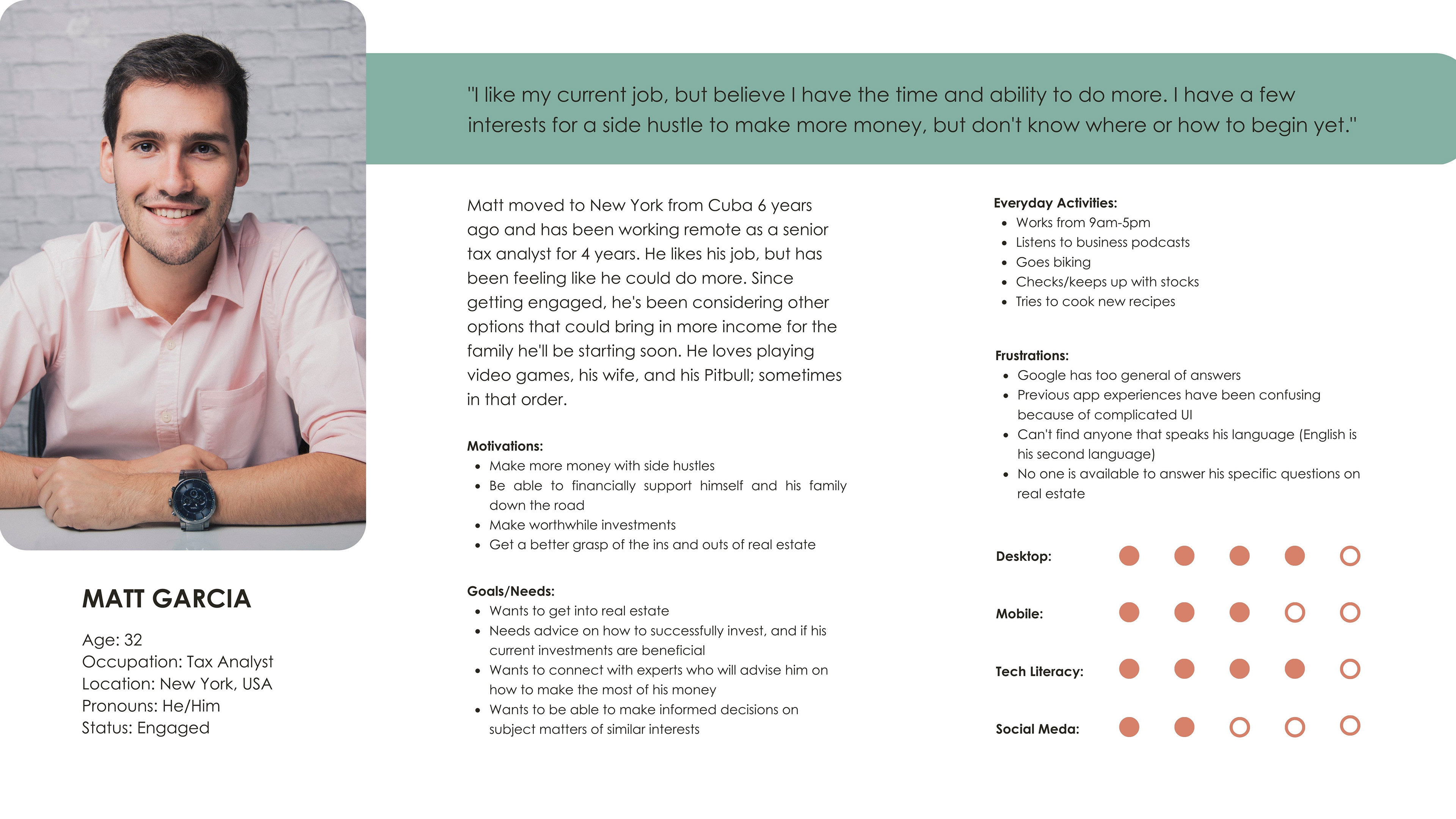
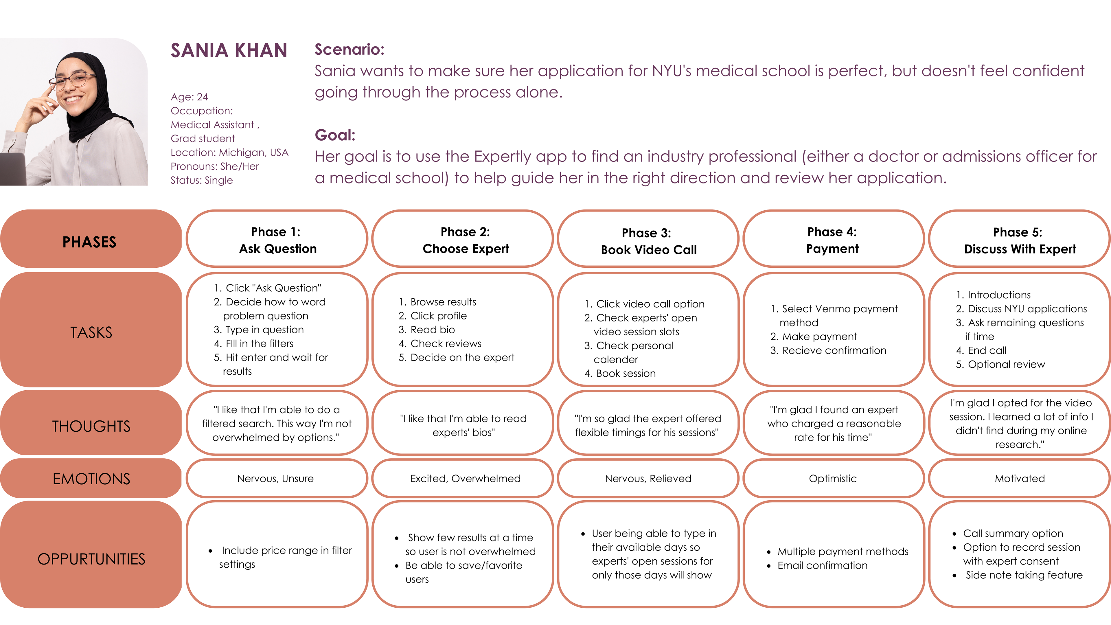
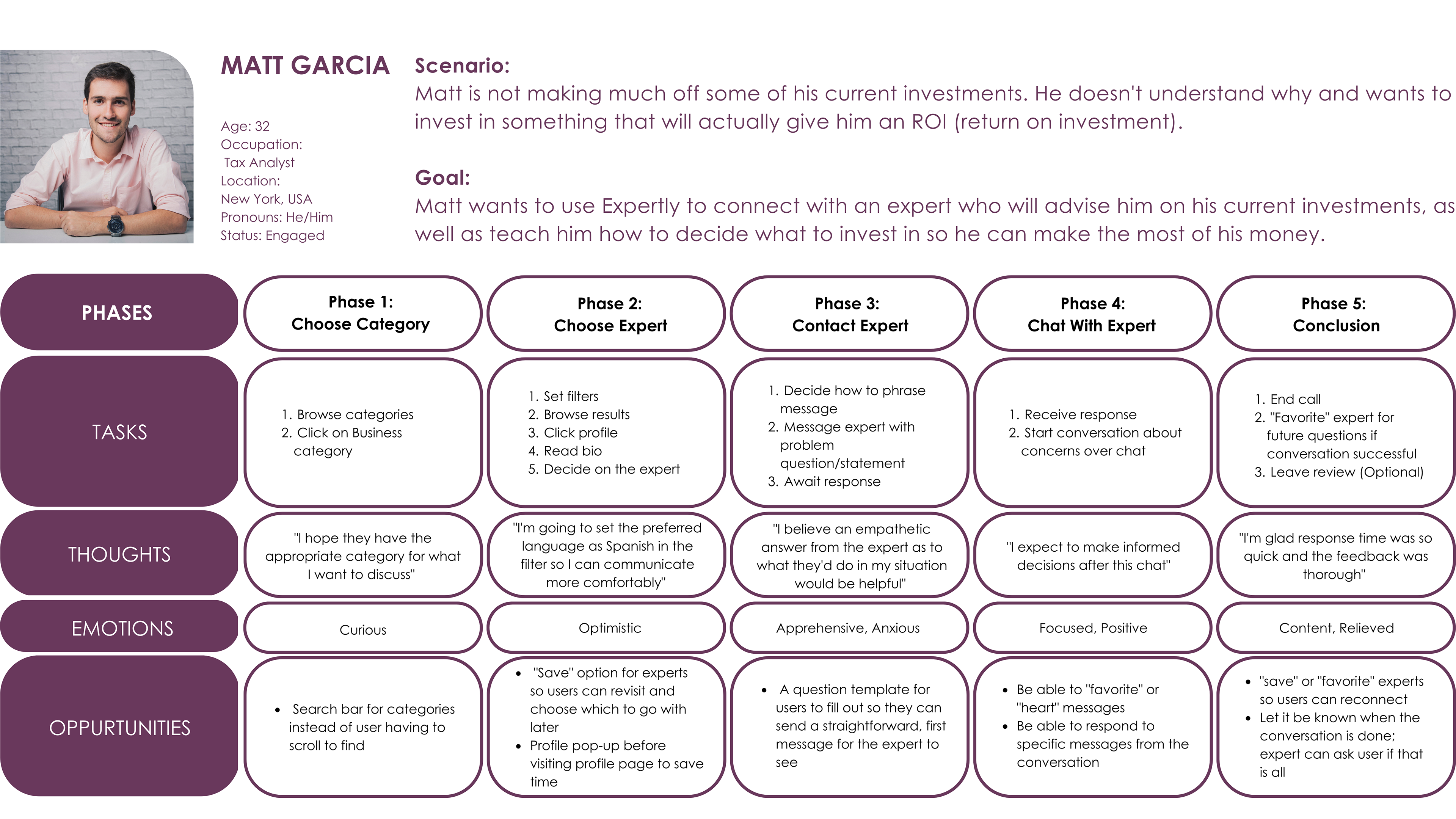
In this stage, I aim to organize and filter all the information I've gathered from the research phase. I'm able to specifically define who my target audience is and form user personas as a result. I have included two user personas, Sania Khan and Matt Garcia, both individuals who require expert help to advance and grow from their current situation. These personas represented who I was designing for and why, and they became a reference point to make sure I was focused on user-centered design process.
From the research phase, I also understood the behaviors and needs of the target audience, which helped me create user journeys and user flows. Creating the user journeys revealed the different elements I needed to include to help users complete tasks.
User Personas:
User Journeys:
DESIGN
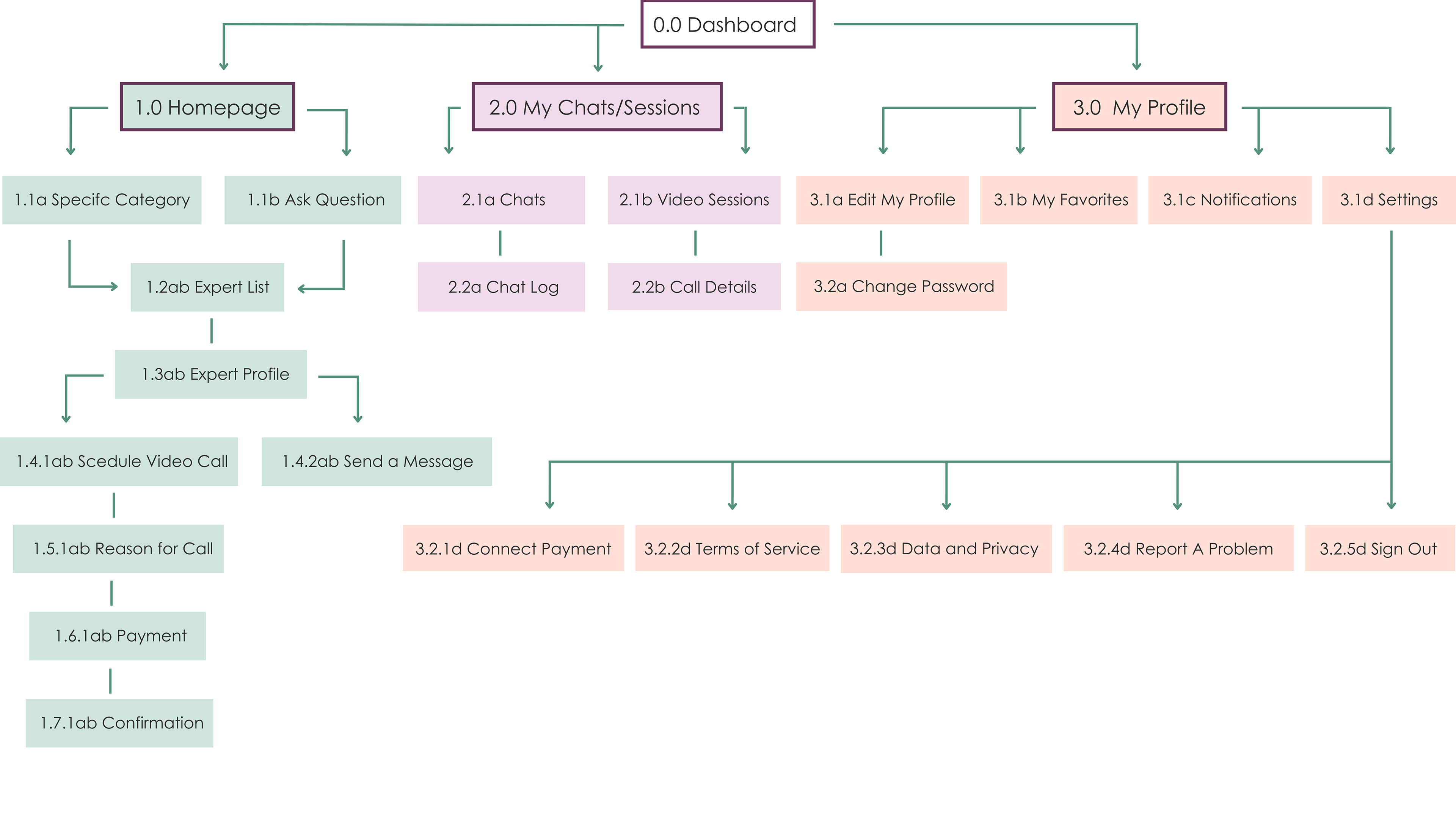
The design stage was the start of implementation. I had all my research and organized it into user personas, user journeys, and user flows. Now I was ready to start planning and implementing the information architecture. I started with a site map that charted the main checkpoints of the app, as well as what content pages users could access stemming from those points. After a card sorting exercise, the site map went through a few more iterations to mirror users' needs.
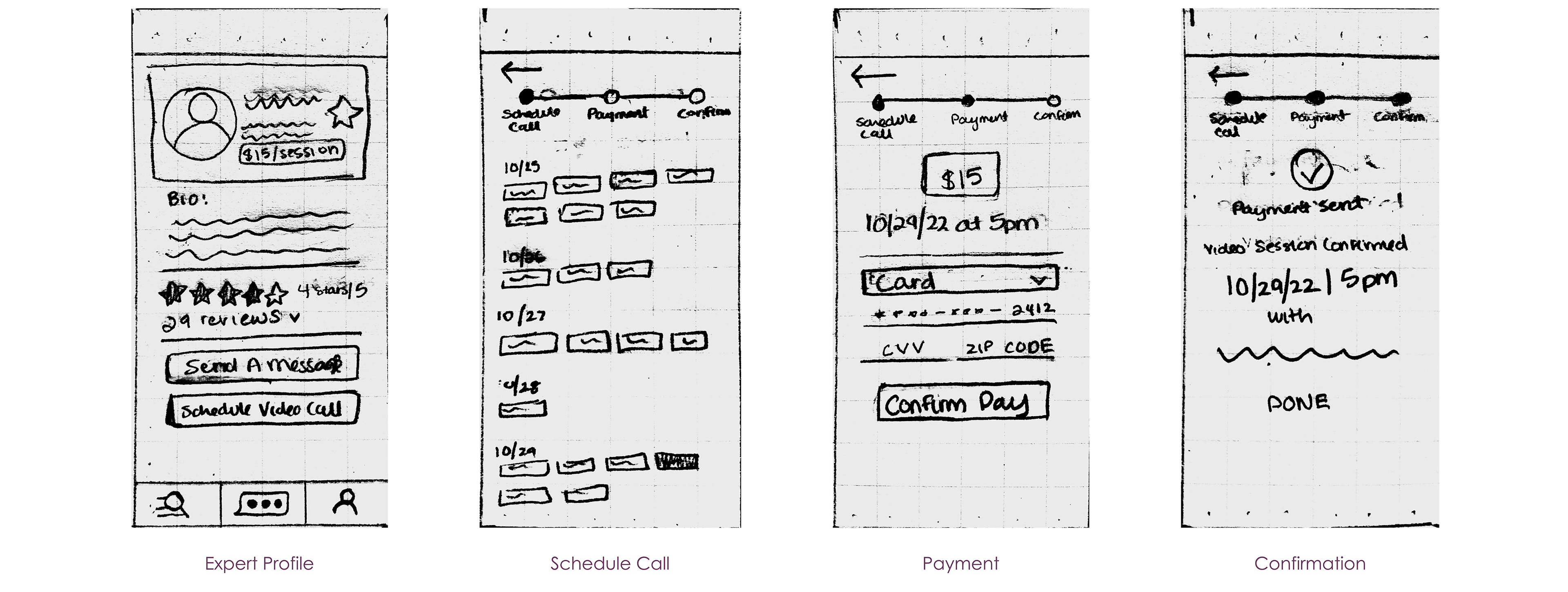
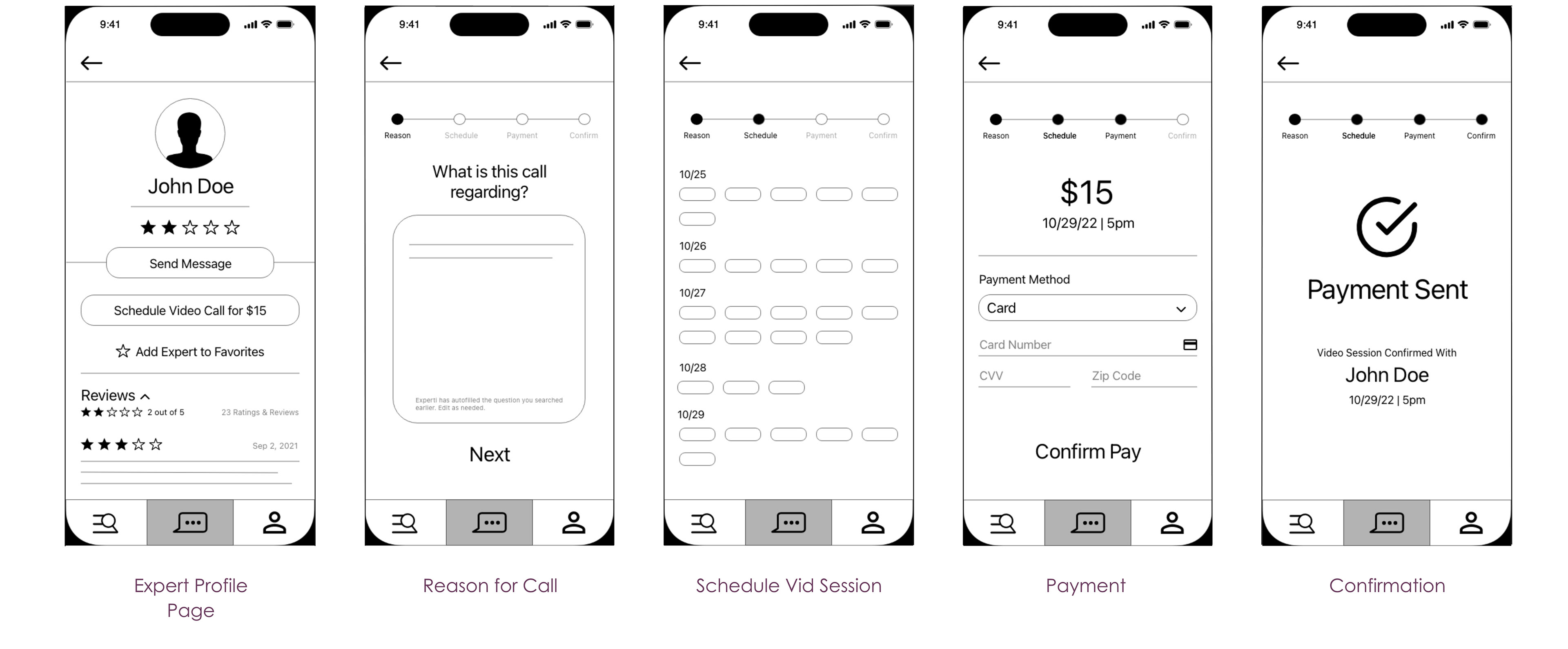
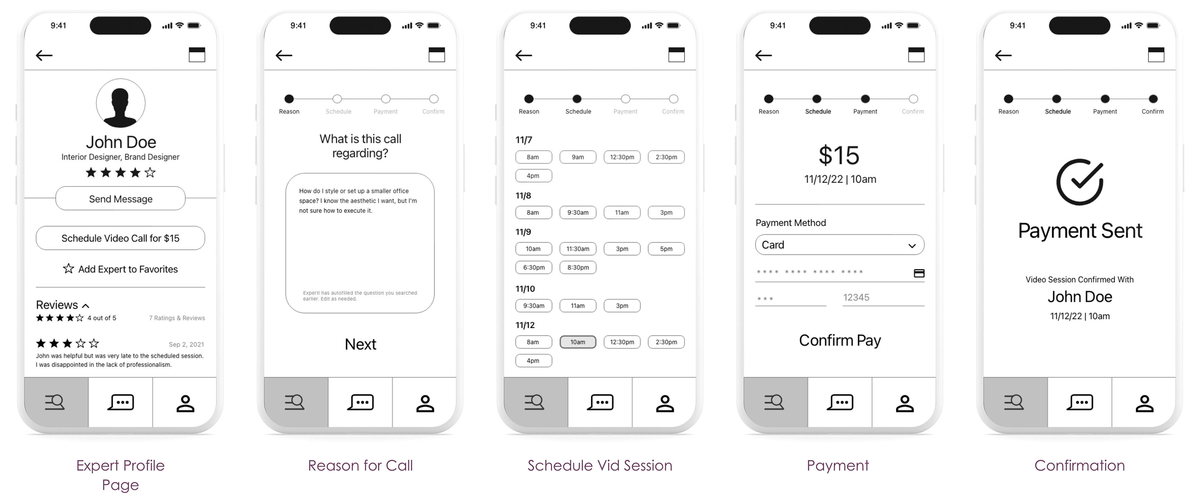
Once I felt like my site map was finalized and I had laid out the order of operations, I started on some low-fidelity wireframes to bring the concept to life. I built upon these initial wireframes as I gained mentor and peer feedback and eventually worked into high-fidelity wireframes.
Site Map:
Wireframes (Low, Mid, & High-Fidelity):
PROTOTYPE
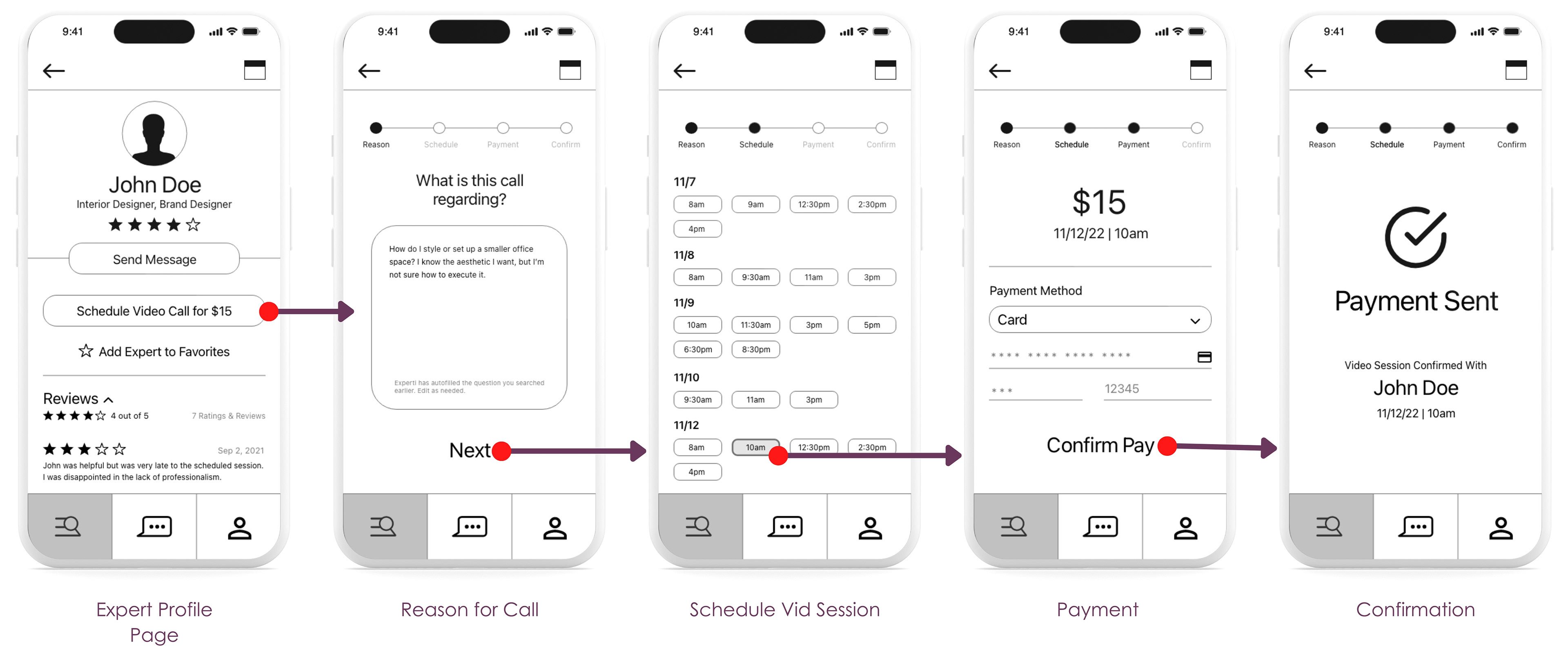
Creating the prototype was a revealing process. By starting to connect all the dots, I was able to see what content is easily accessible and what content is hard to access. Recognizing those elements helped me remove complications and implement any solutions to create a smoother experience for the user. My method involved a lot of back and forth between prototyping a few wireframes at a time, then going back to check how it functioned in the eyes of the user. I used Adobe XD to turn the wireframes into a clickable prototype that would be used for usability testing.
(I chose to only depict the prototype pattern for one feature, but the full link to the tested prototype can be found here.)
Tested Prototype:
TESTING
After I finished turning the high-fidelity wireframes into an interactive prototype, it was finally time to put Expertly to the test. I conducted moderated, in-person usability tests with 6 participants. All users were told to think out loud as they viewed and navigated through each content page. I screen-recorded their interactions to analyze later and took notes on their behaviors, actions, thoughts, and feelings. The main goal of usability testing here was to observe if users are able to interact with Expertly successfully by showing completion of tasks and ease in using the app's navigation.
I organized all my notes into an affinity map and rainbow spreadsheet after concluding testing. Doing so uncovered patterns and themes among user feedback. Many users faced similar issues and had the same concerns. I was able to prioritize those issues based on Jakob Nielsen's's error severity scale and ideate solutions that would create a better user experience.
Affinity Map:
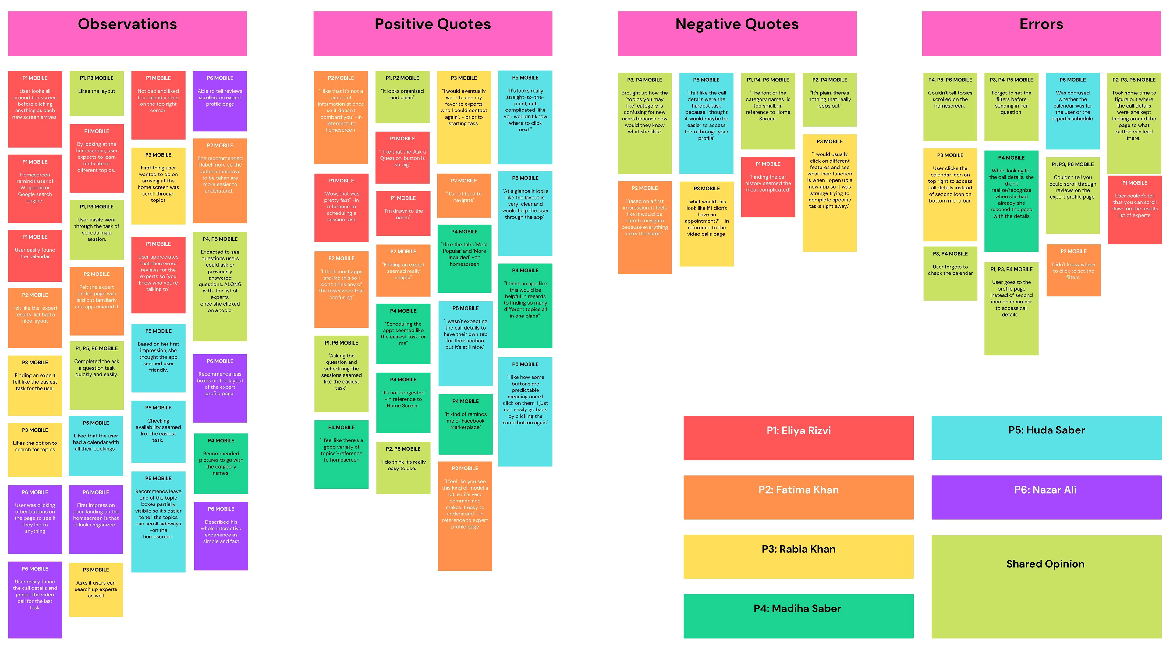
Usability Test Report Findings:
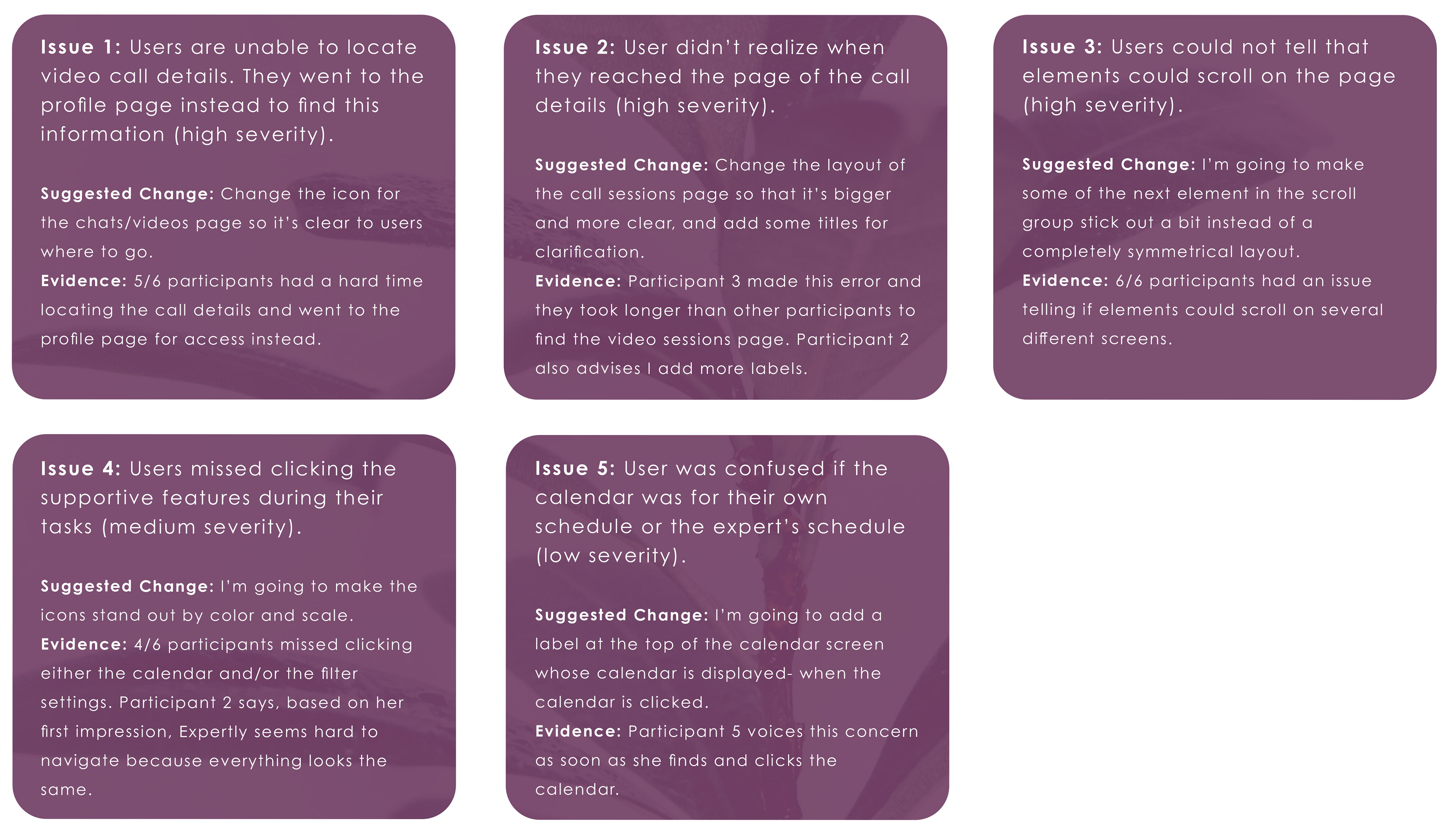
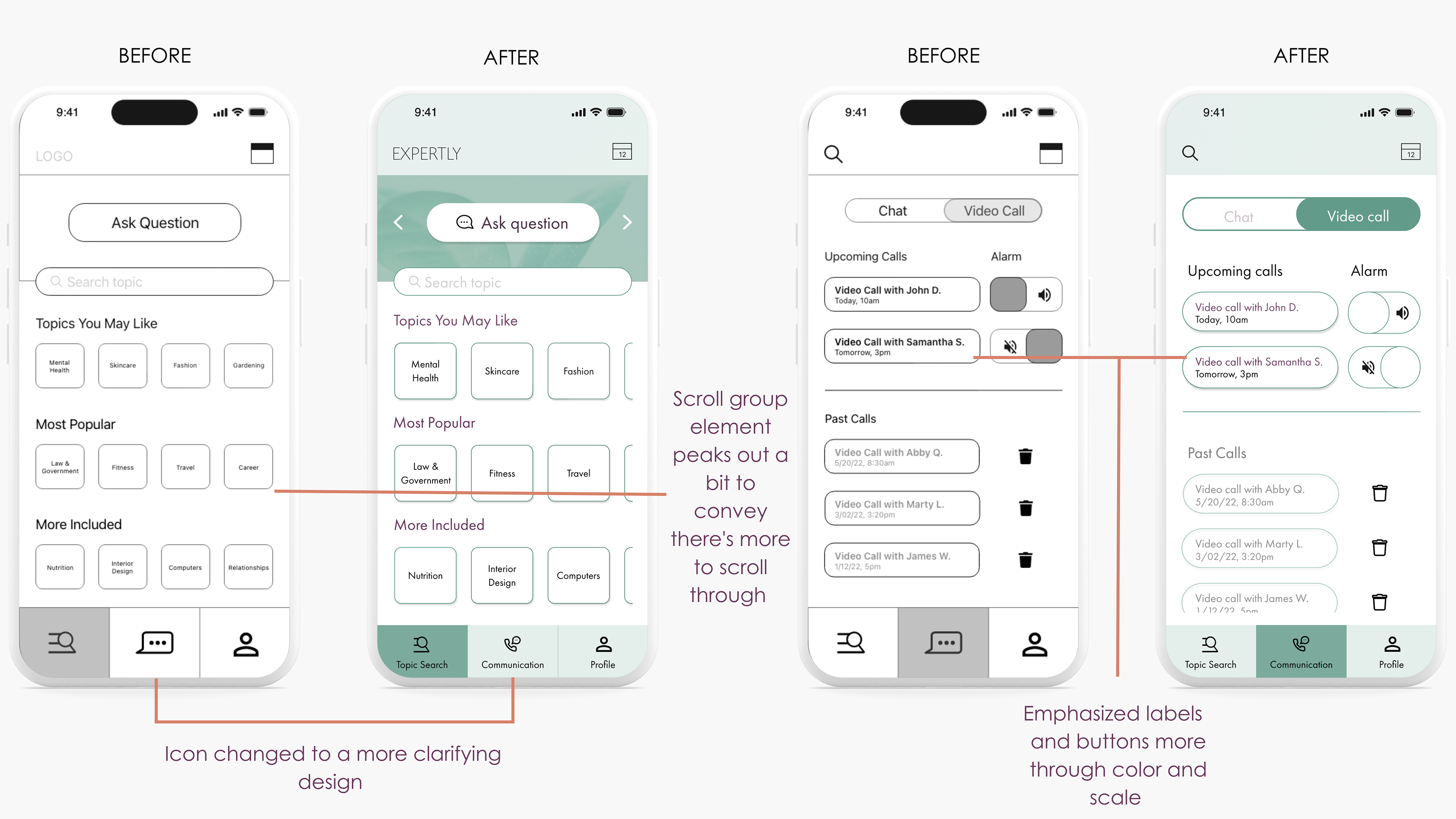
Some Changes Implemented:
LAUNCH
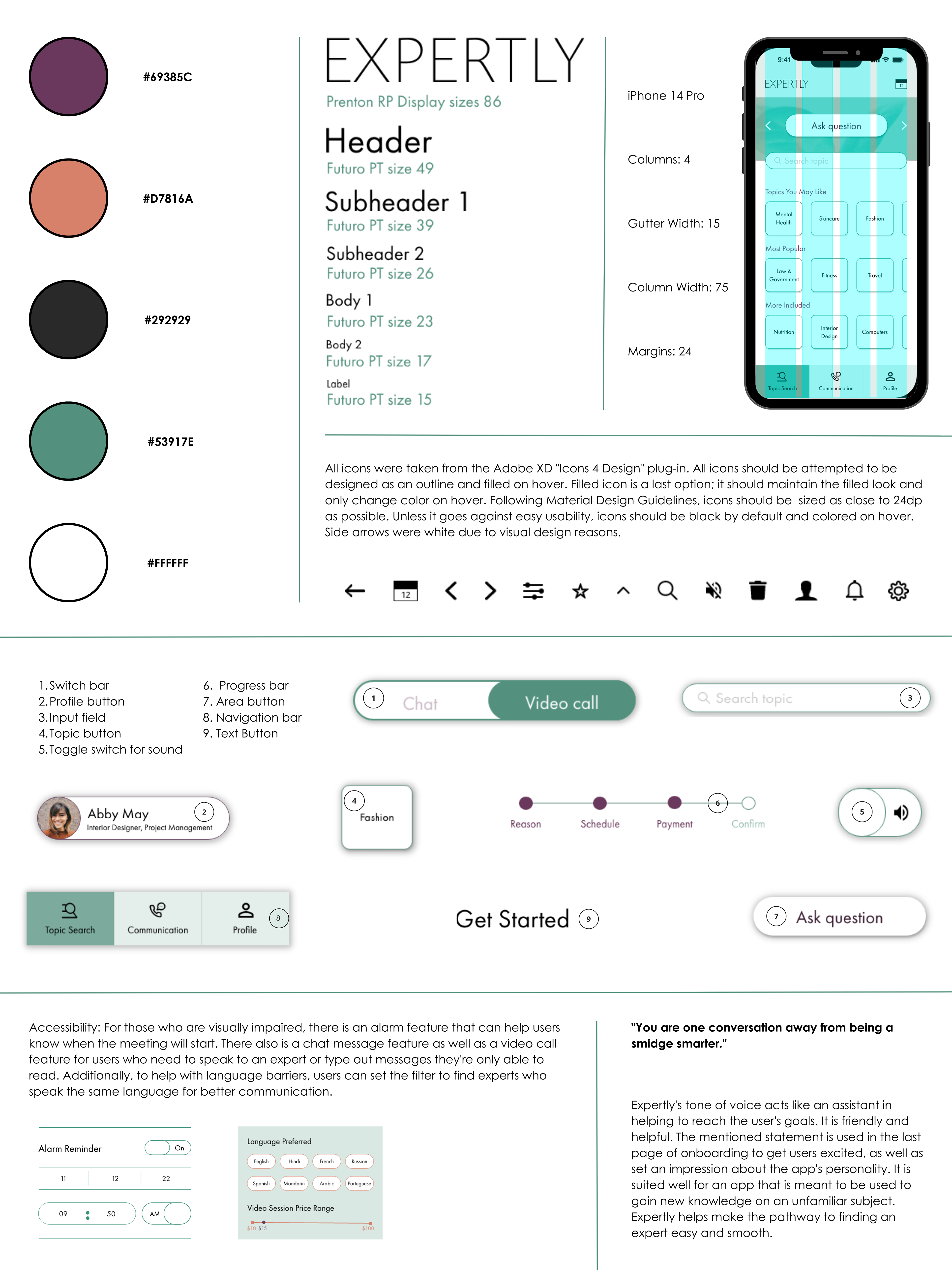
Once I had finished applying the suggested changes, I worked on the app's UI. I had some ideas of what I wanted Expertly's aesthetic to communicate with its audience, but this stage was really where I was able to plan and execute those ideas. I wanted Expertly to have a clean, clear, and friendly aesthetic, but something that expressed professionalism as well. This way, users would feel welcomed by the content, but maintain a sense of reliability with the app at the same time.
I worked on the app's design language system thoroughly so I could clearly present the reasons behind my design decisions. As each screen was cleaned up and polished, Expertly finally started to come to life.
Design Language:
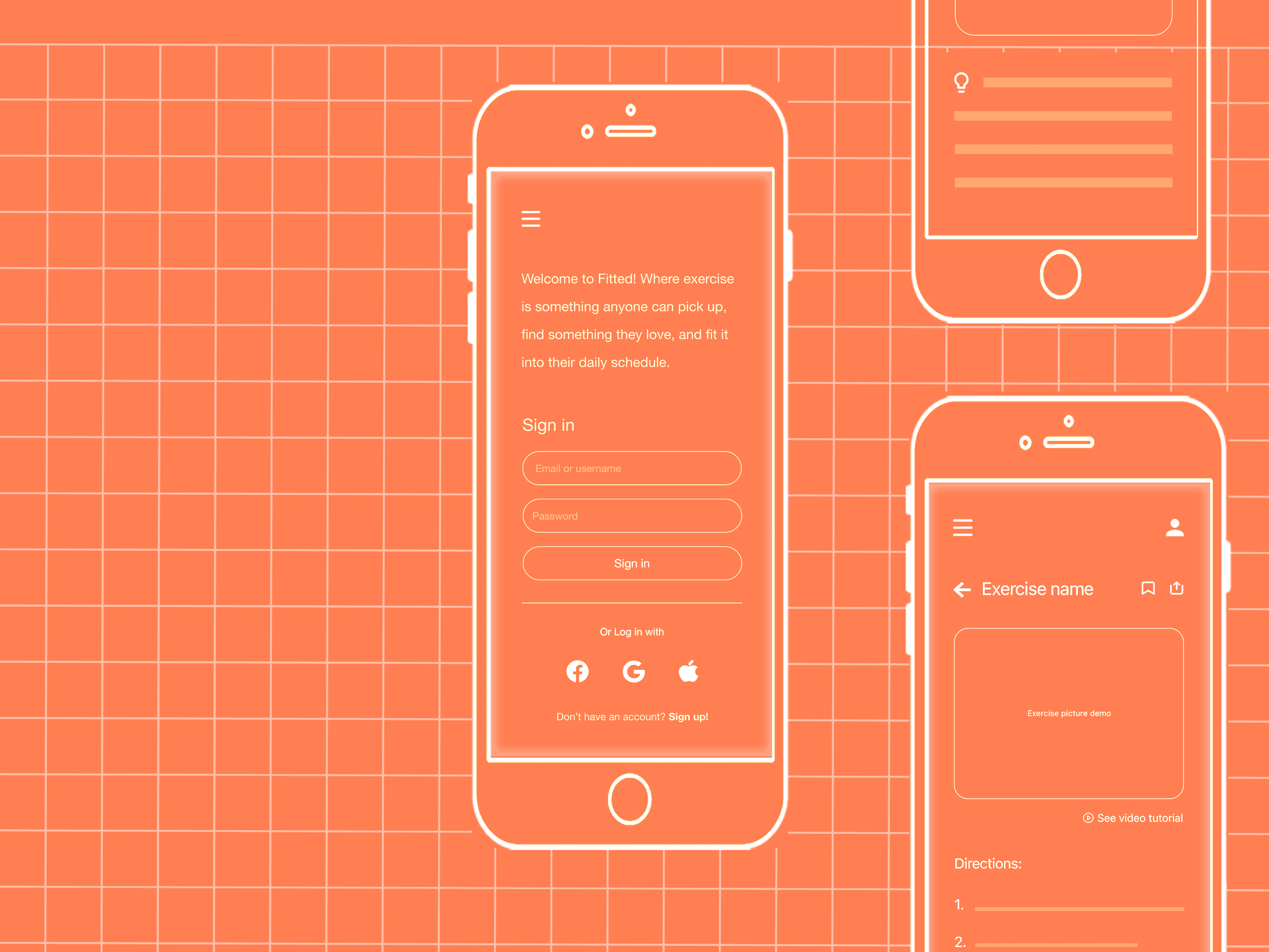
Final Screens:
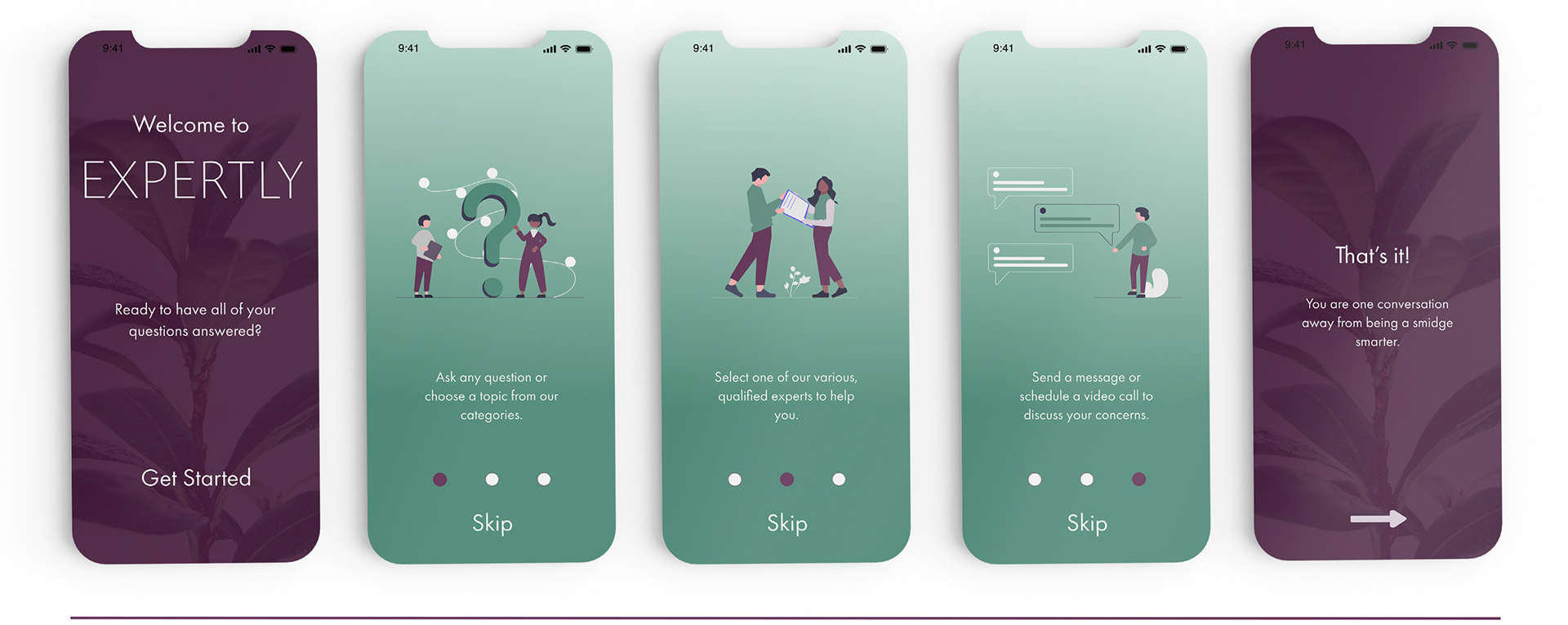
Onboarding
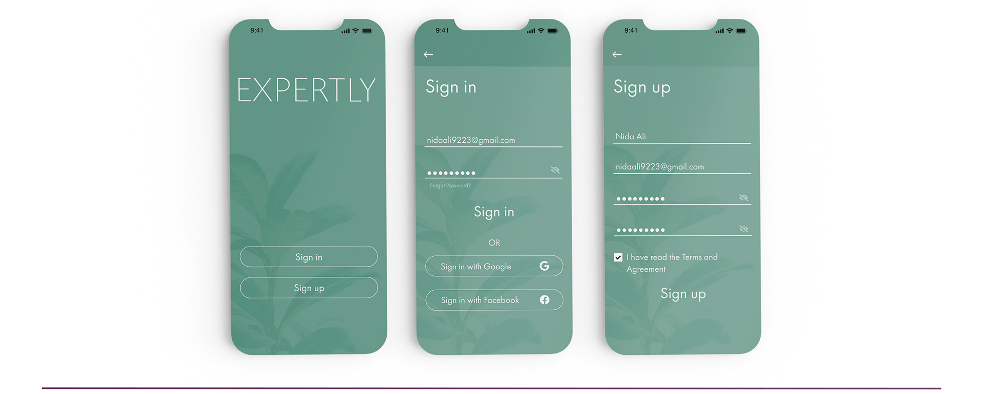
Sign-in / Sign-up
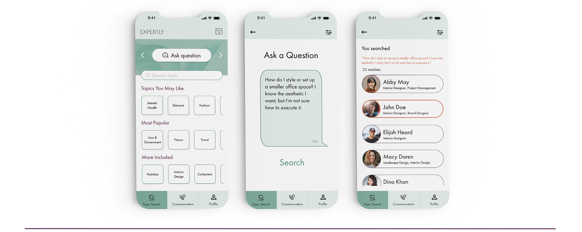
Ask A Question
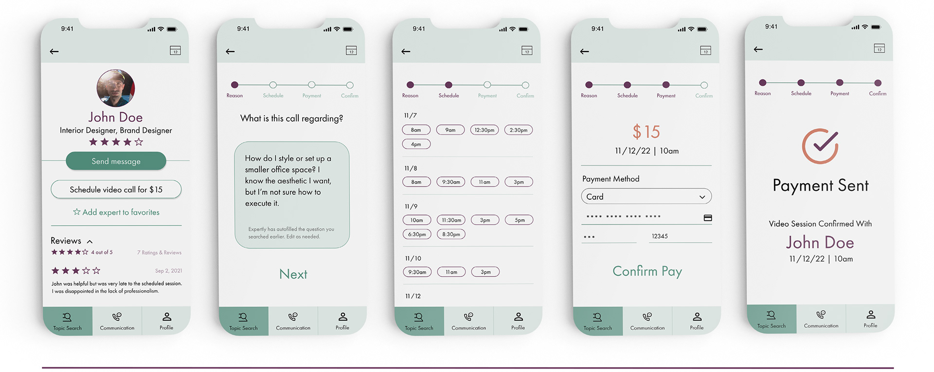
Schedule A Video Call
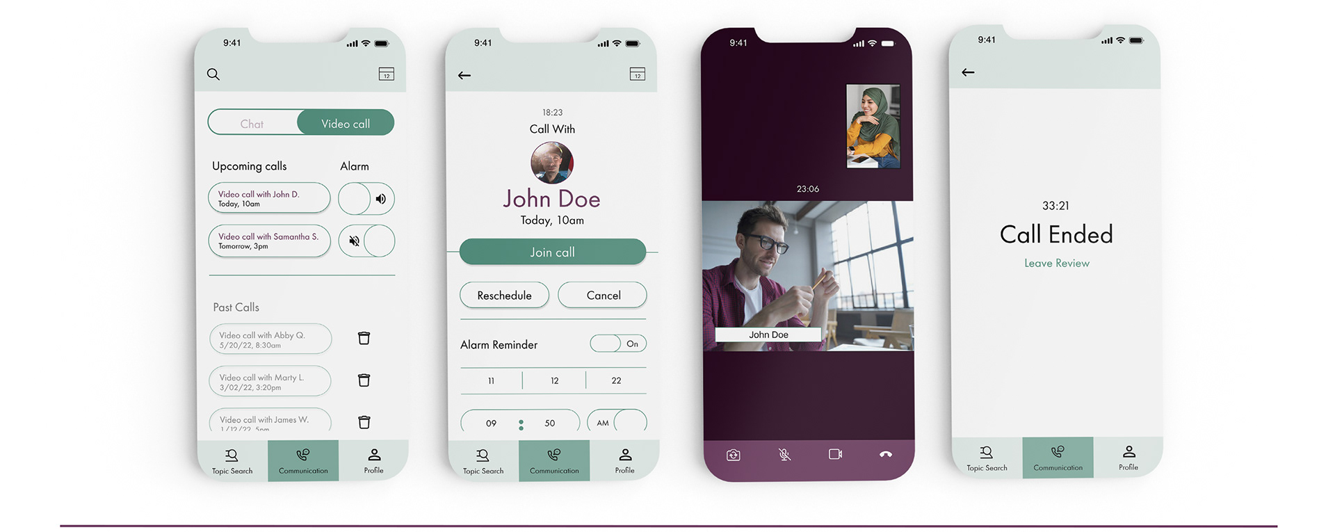
Video Call

Profile Page
WHAT I'VE LEARNED & NEXT STEPS
Working on Expertly was a fascinating learning process. I gained knowledge on UX methods I hadn't tried before like card sorting and affinity maps, and I was able to brush up on existing skills like planning information architecture and prototyping. I've learned how rewarding an iterative process is when I'm able to see not only improvements in my design, but meaningful improvements that are backed up by reason. There were times where I've felt like I kept questioning my design decisions because as a designer, you want to create the best experience you can for the user; it's a big job. I found myself embracing peer critique because it helped improve my design, as well as broadened my perspective. I'm glad with where I ended up with Expertly, but understand there's always room for improvement.
In the next steps to improve the app, I would love to focus on how Expertly could be more user friendly, more convenient, and more useful. I believe Expertly holds room for more functionality and I would love to add more features such as articles on specific topics and maybe video tutorials for more hands-on topics. I'd like to work towards advancing accessibility because Expertly can come extremely useful to people with disabilities. Finally, there's always room for improvement when it comes to the UI. I'd want to add more imagery and deliver the aesthetic of Expertly more than the visuals currently do.
Thank You.