Design Process:

SCOPE:
Fitted is a B2C project with a heavy focus on the UI. During this case study, I primarily took on the role of a UI designer, with less focus on UX, as the core problem, user personas, goals, and feature requirements were already defined. My job was to dive into the UI and present the solution effectively and aesthetically. I learned and implemented proper industry standard guidelines when it came to visual organization and layout, while also keeping UX in mind. From creating wireframes to applying alignment, spacing, typography, and color, I ensured the data was presented in a way that would look familiar, friendly, and attractive.
UNDERSTAND
Problem:
In today’s fast-paced world, most people struggle to take care of their health on top of everything else. Even if they want to make a change, users don’t always know where to start. For someone who’s brand new to fitness or returning after a long period, it gets confusing on what routine to establish, what that routine should include, and when to make time for it within a busy schedule.
Solution:
Fitted is a responsive web app designed to bridge the gap between users and fitness. It connects users with exercise routines suited to their individual fitness levels and designed to fit seamlessly into their daily lives. With guided workouts and motivating challenges, Fitted supports users every step of the way as they build healthier habits and move toward optimal well-being.
USER FLOWS
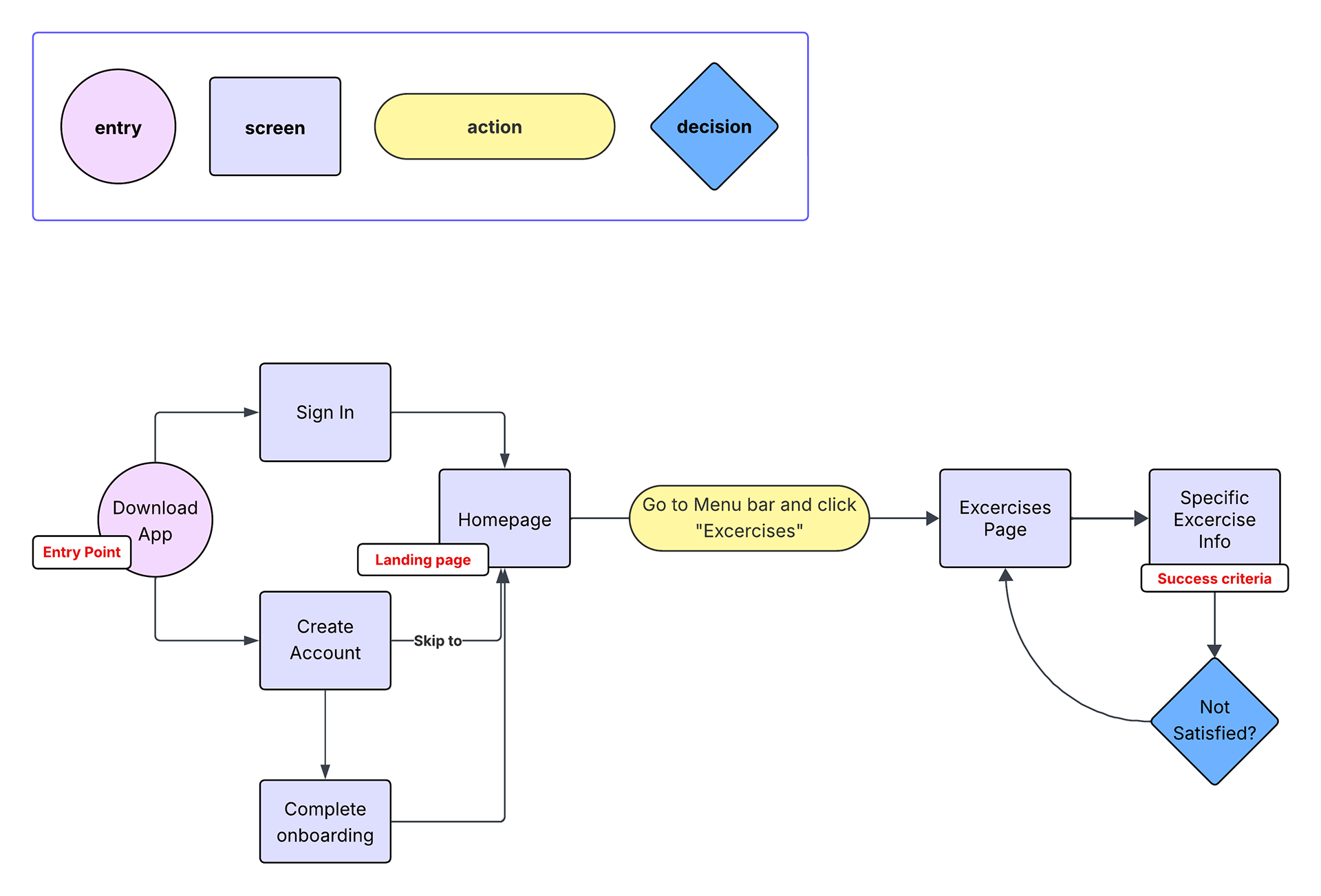
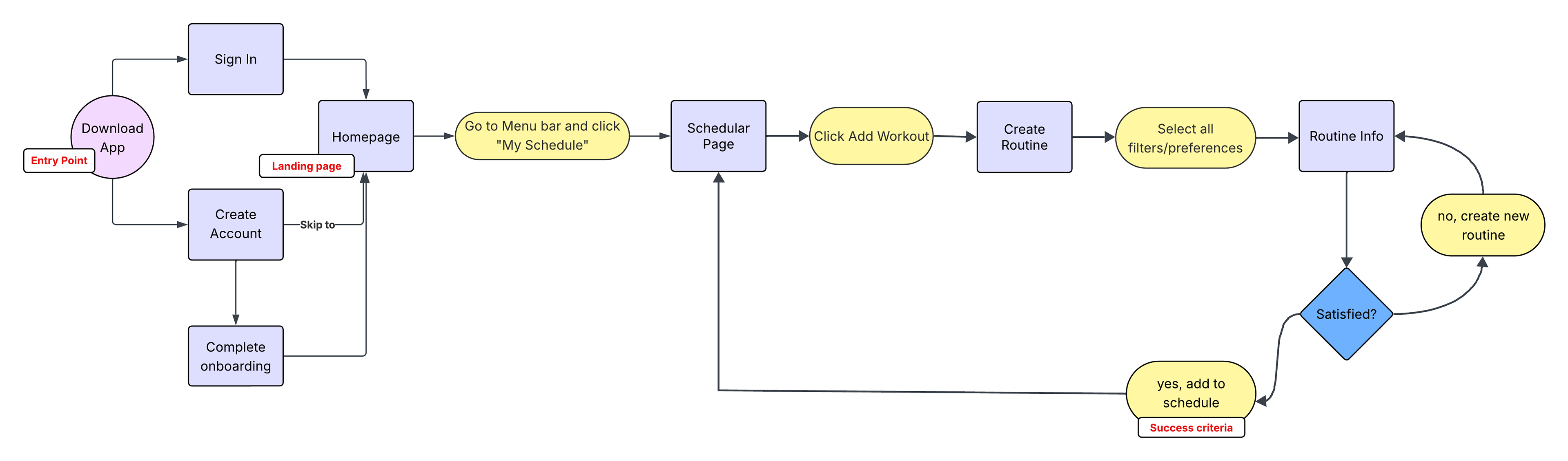
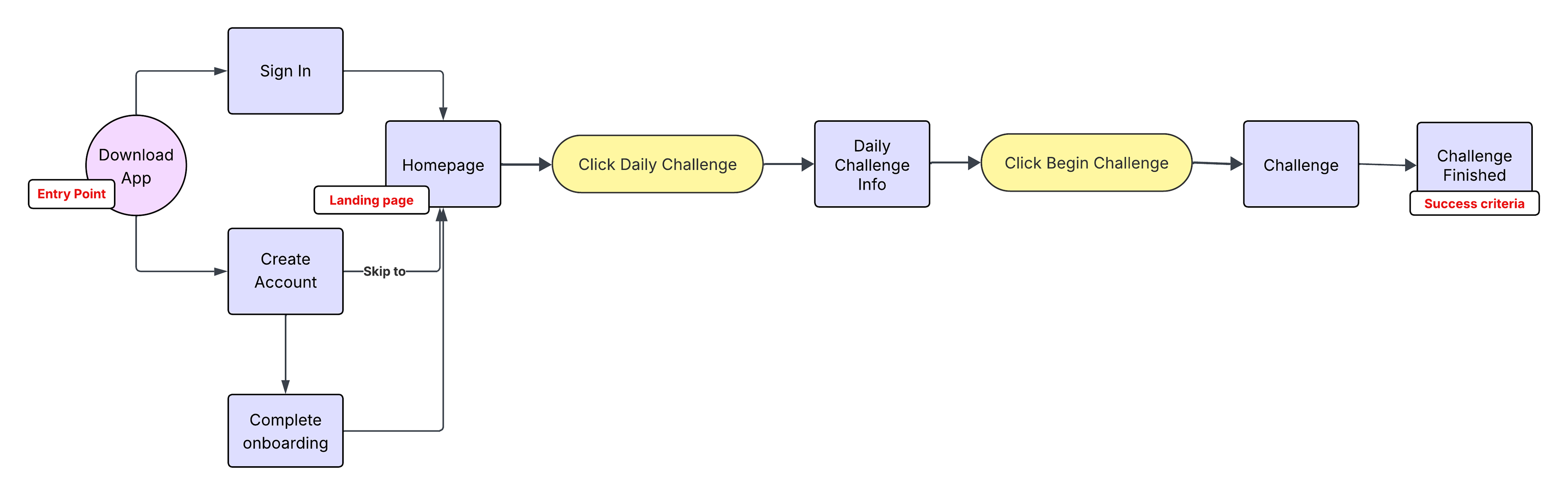
The project brief for Fitted outlined certain features that needed to be included, such as a search and filter for exercises, an exercise scheduler, daily challenges/achievements, and social sharing of favorite exercises. Prioritizing these features, I created user flows to help me determine the pages I would need to include. I created 3 user flows in total. The first one depicts the process of searching and filtering exercises, creating user accounts, and an option for sharing an exercise with friends. The second user flow shows the process of creating a workout routine and adding it to your schedule. Lastly, the third user flow describes how the user can access and complete their daily challenge.
User Flow 1:
User Flow 2:
User Flow 3:
WIREFRAMES
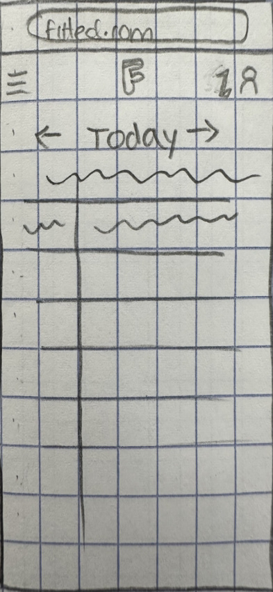
Seeing all the pages I now needed to cover from the user flows allowed me to get a clear start on the wireframes. As I drew up the screens, I was visualizing the kind of look and vibe I wanted this app to have: simple, approachable, inviting, and friendly. Especially for new/returning users, it was important that the app wasn’t crowded and overwhelming and felt easy to navigate. I focused on the main purpose of each screen and avoided overloading it with too much information.
Wireframes for Flow 1:
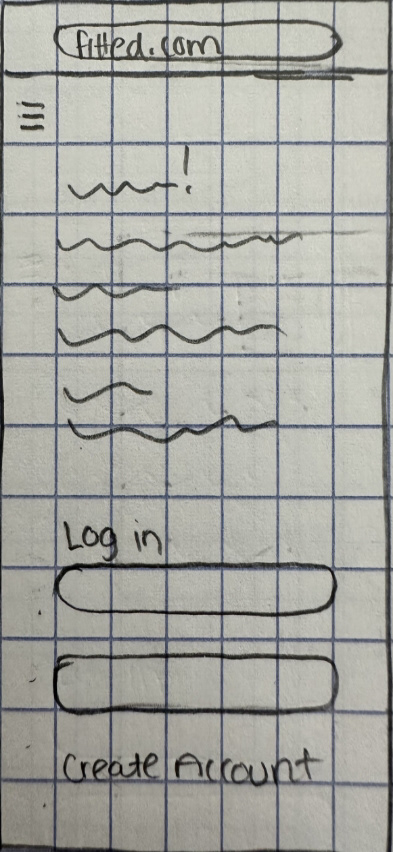
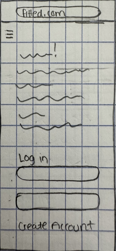
Log in/ Sign up

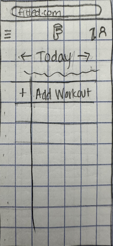
Dashboard
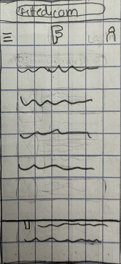
Menu Bar
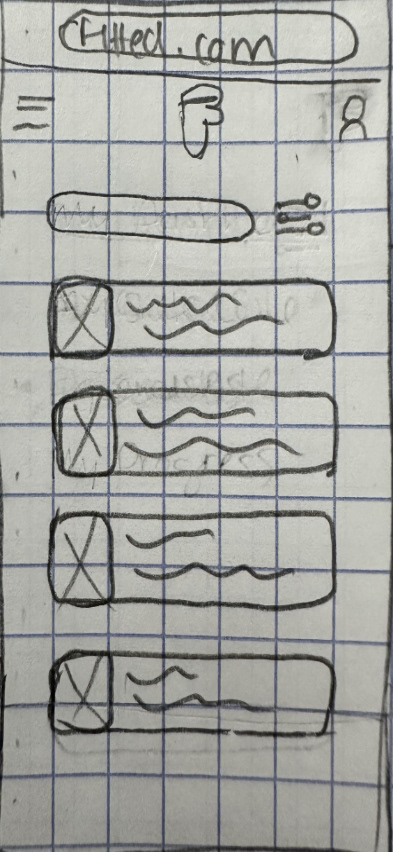
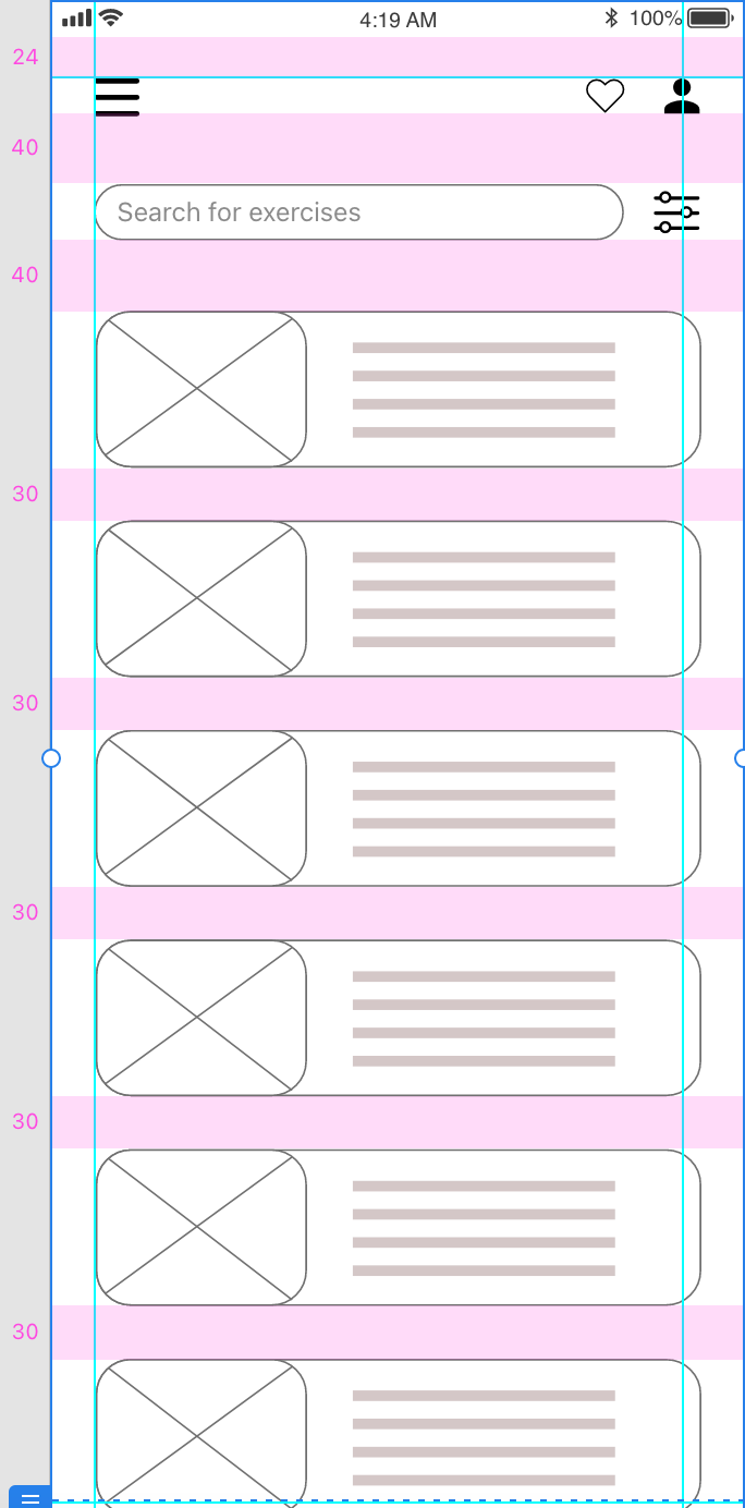
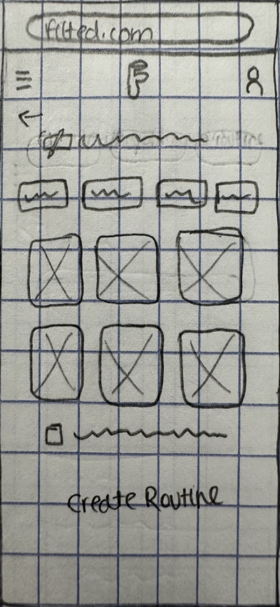
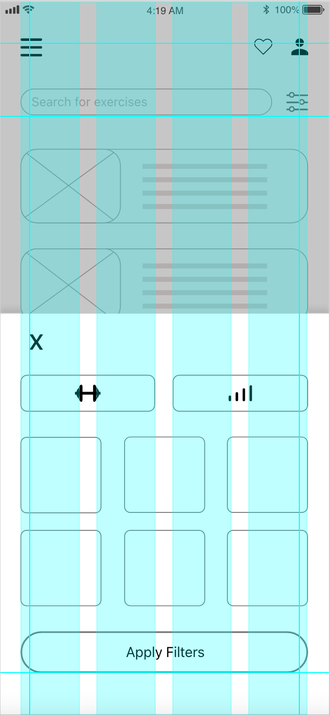
Exercises Page
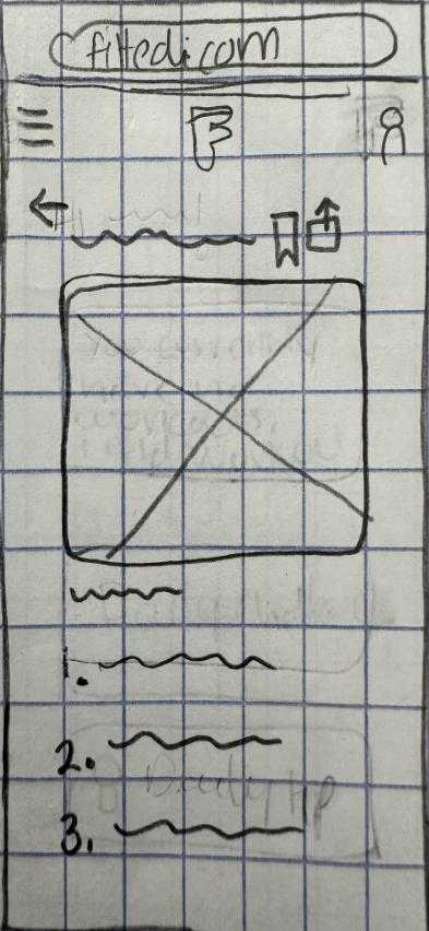
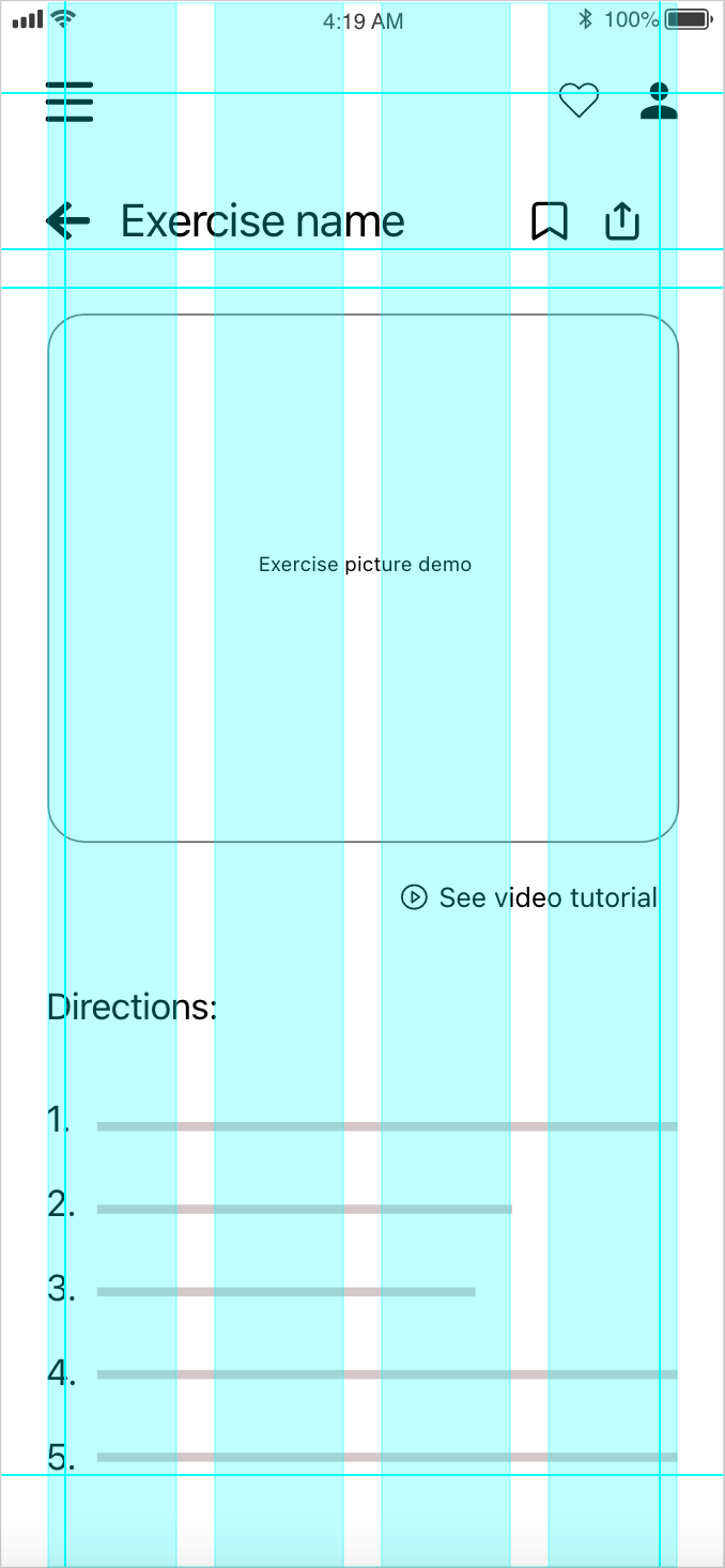
Specific Exercise Info
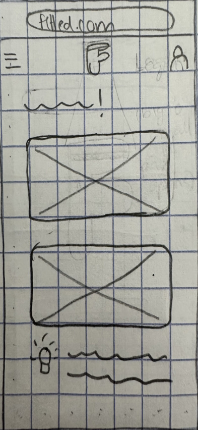
Wireframes for Flow 2:
Log in/ Sign up

Dashboard

Menu Bar
Schedular
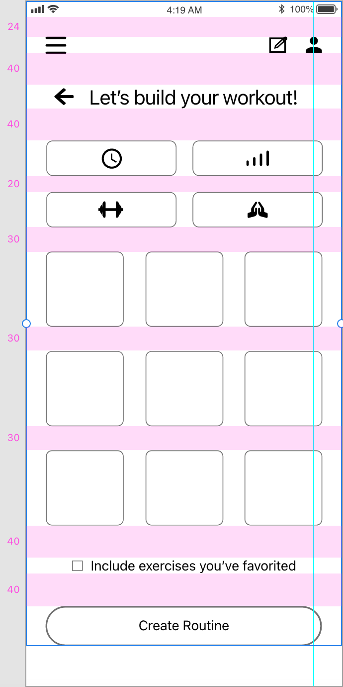
Create Workout
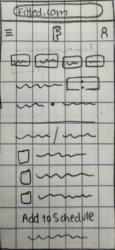
Workout Details
Workout Added
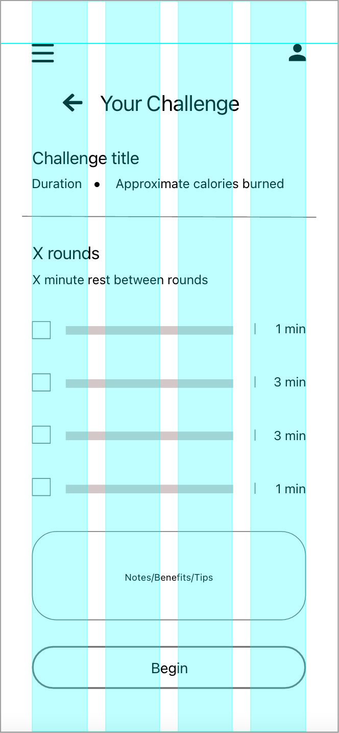
Wireframes for Flow 3:

Log in/ Sign up
Dashboard
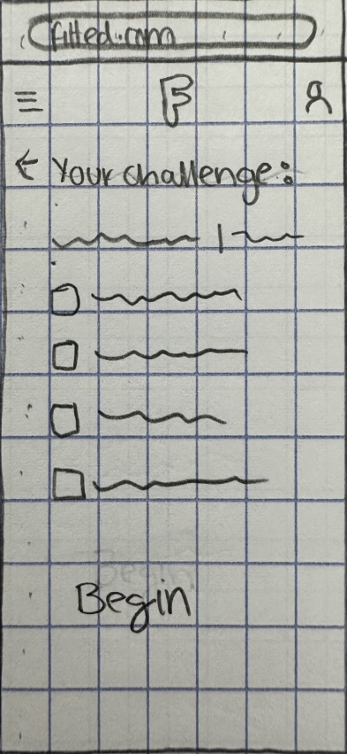
Daily Challenge Info
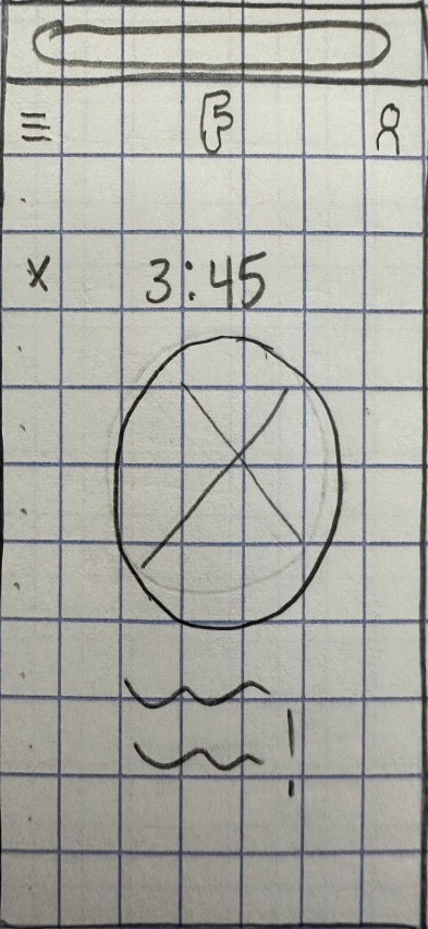
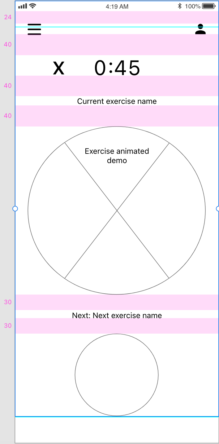
Challenge Started
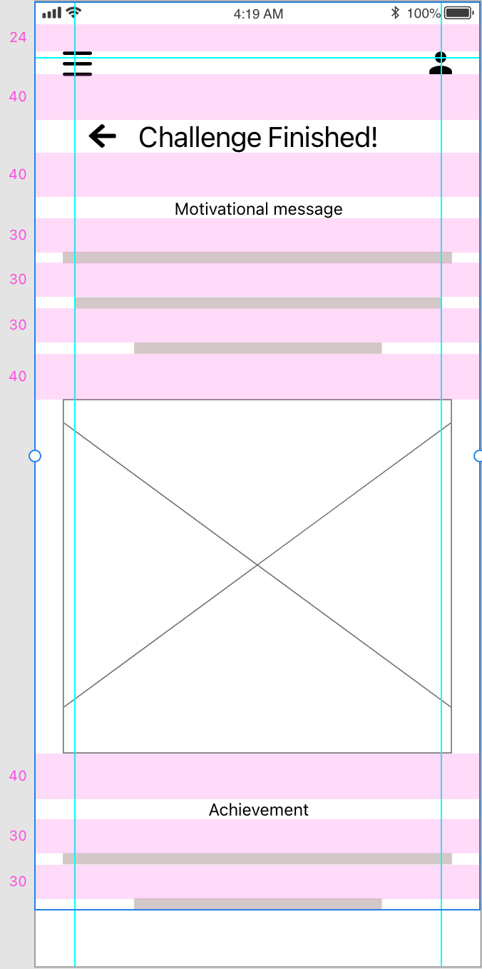
Challenge Finished
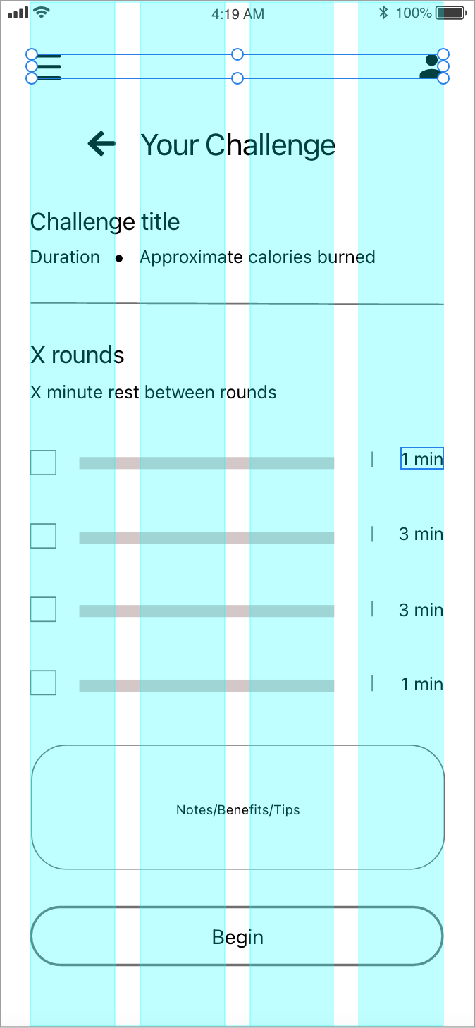
GRID ALIGNMENT
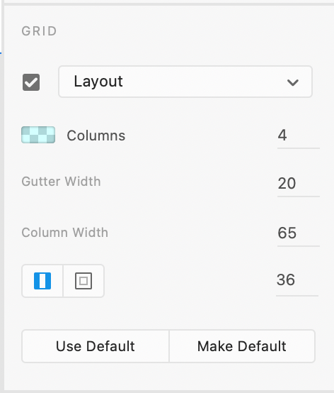
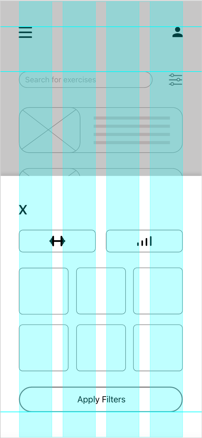
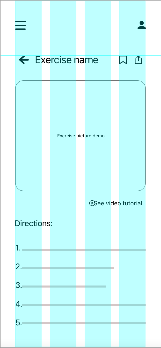
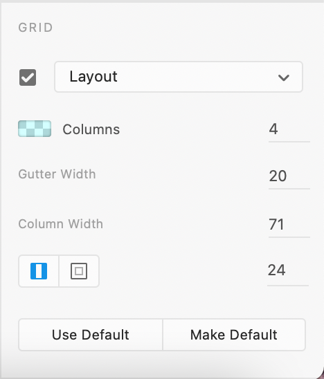
I created the mid-fidelity wireframes next, digitizing all my drawings to ensure cleaner screens for the next steps. I applied a 4-column grid layout, each column with a width of 71px and a gutter width of 20px. My side and top margins are 24px, and my bottom margin is 50px.
Initially, my top and bottom margins were 50px, and side margins were 36px. After grid alignment, I realized that just because it looks neat, it doesn’t make it automatically user-friendly. After some research, I found that common iOS design practices use 16–24px for side margins and top padding, and 24–50px for bottom margins. I revised the layout by applying proper spacing and adjusting all components. Although the process required a lot of revisions, I knew all my previous effort would be wasted if the layout didn’t feel familiar to users.
Before and After Proper Grid Alignment:
Before
Before
Before
Before
After
After
After
After
SPACING
I applied Gestalt principles (such as proximity, similarity, common region, and continuity) between components, and I assumed the structure it brought suggested there were small corrections to be made. However, the spacing measurements between all elements proved otherwise. I applied organized spacing within most content groups. Still, there was a lack of consistency when comparing different content groups.
I revisited all groups of information, starting with the buttons. As I moved through the content, I quickly began to notice how some padding measurements were not only consistently showing up, but also making sense to apply throughout. 20px between one category of buttons, 30px between similar buttons, 40px between different groups of buttons, and so on. I applied these number patterns that made sense visually and technically to all content groups within and around. Instantly, I could recognize how much more orderly and systematic the layout looked.
Padding Measurements: